AGNSW collection John D. Moore Chaos 1923
https://www.artgallery.nsw.gov.au/collection/works/484.1996/

What makes an artwork different from 'the real world'?
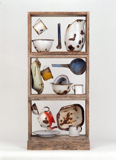
Imagine if you tossed a box full of junk onto the gallery floor, and walked away. Would it still be there tomorrow? How would the cleaners decide whether it is art,or just junk? What makes Rosalie Gascoigne's sculpture, ‘Enamel ware’ art? That is what this exhibition is about.
For each of the artworks here, ask yourself, 'How has this artist turned chaos into order?' Imagine, using the artwork as inspiration, how you might alter your pile of junk to make it look like it is meant to be in an art gallery.
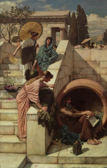
The huge pot in which Diogenes sits makes a very strong circular shape. See how Waterhouse repeats, or 'echoes', this shape many times. How many can you see? Waterhouse also repeats certain colours, such as dusty pink.
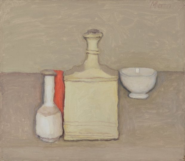
Morandi has chosen only objects that are roughly rectangular in shape and light grey in colour. He has also arranged them so that many edges line up with each other.
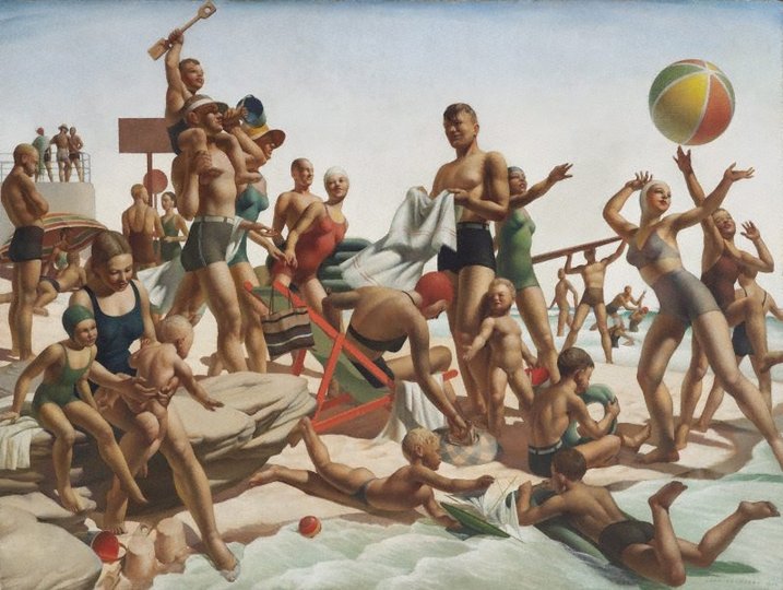
Charles Meere has 'constructed' his beach scene using echoes of three basic shapes (circle, triangle, rectangle) and three basic colours (orange-red, yellow and blue-green). Why didn't the artist just paint exactly what he saw at a real beach?
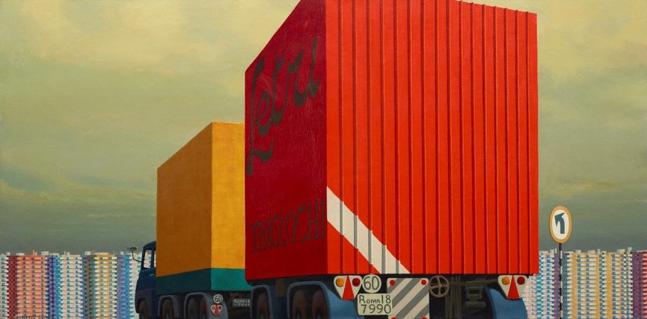
Jeffrey Smart has 'constructed' his painting with geometry. Look at the proportions of the rectangle: Notice how it is like two squares, side-by-side. What lies exactly on the line where these two squares join? See how many more shapes and edges you can find that have a 'special' relationship with the rectangle.
Artists usually try to give their artworks unity: the quality that makes everything look like part of a 'whole'.
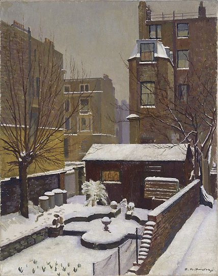
Sometimes nature helps artists achieve unity by hiding things, or at least making them harder to see.
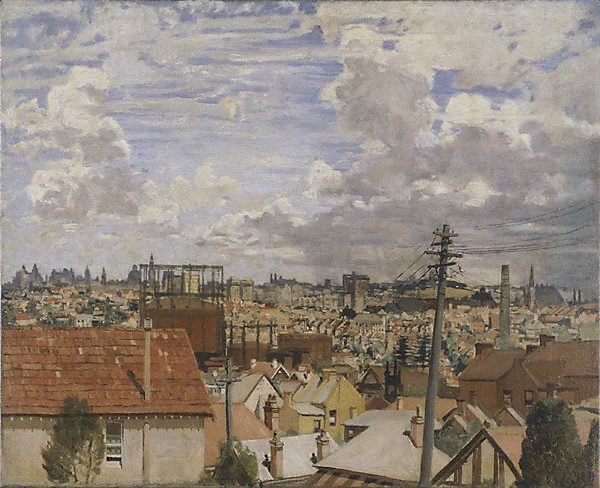
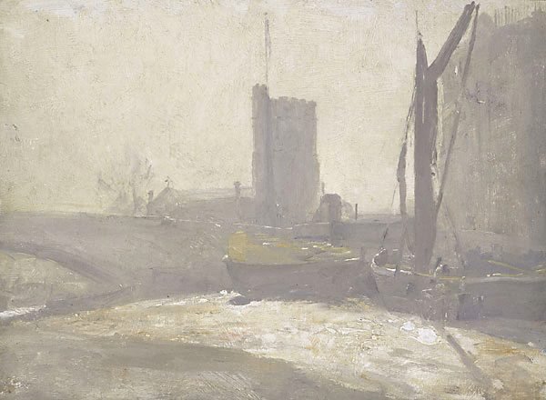
The fog in Tom Roberts' painting softens edges and details, and makes colours lighter and less intense. How does this add to the painting's unity?
How has nature helped Douglas Dundas?
Giving an artwork a single, overall colour is a very good way to give it unity.
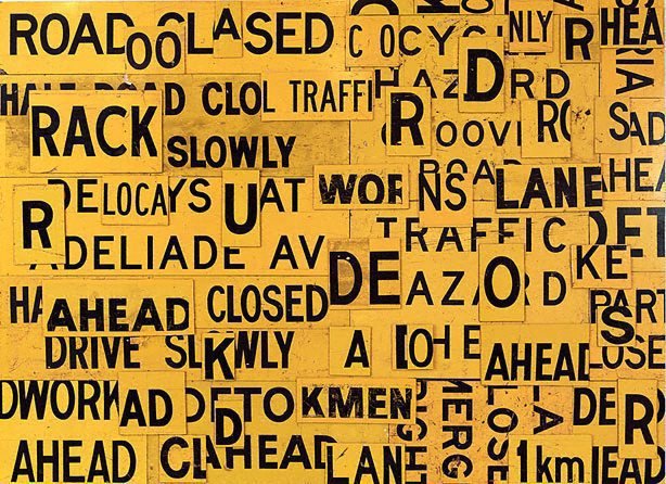
Rosalie Gascoigne has selected only yellow reflective road-signs for this artwork. How else has the artist ensured her artwork has unity?
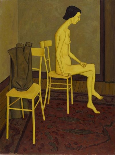
Sometimes artists don't wait until the real world gives them a single, overall colour. John Brack has shifted the colour balance strongly towards yellow without any realistic explanation. Apart from helping the painting's unity, why else might Brack have done this?
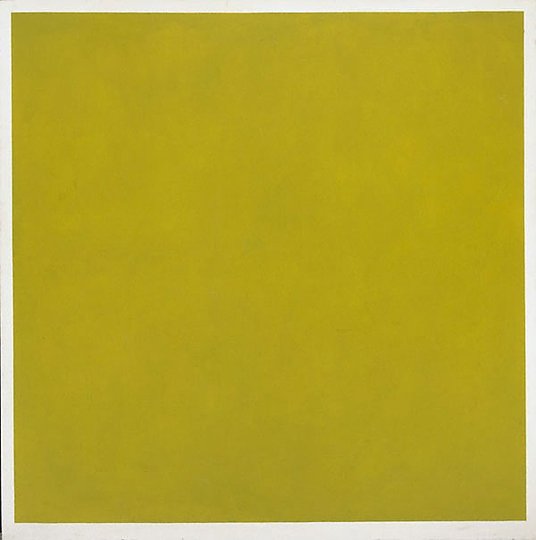
What happens if an artist decides that a single colour is the “main event”, that anything else would be a distraction? Scroll down to find out...
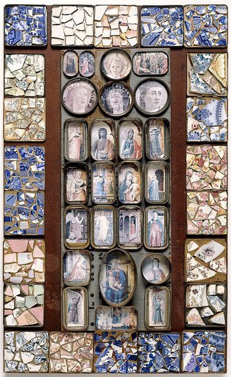
One simple but effective way of turning chaos into order is to arrange the separate objects into a grid. Each thing has its own space and its own identity; yet together they create a strong sense of unity. This technique has been popular since ancient Mesopotamia. It can also be seen in many traditional Aboriginal bark paintings. Here are two contemporary examples, one by an Australian artist (Rosalie Gascoigne) and one by a Japanese artist (YAMAMOTO Tarō).
We have seen that many artists keep elements separate, in a grid, to achieve unity. Another method is to do the exact opposite: to break the elements into smaller pieces and let them partly blend with each other.
Every artwork begins as an experience, which becomes its 'raw material'.
It is as though the artist is saying, "I like this pile of junk; what can I do with it to make it my own?"
When we recognise an artwork as by a particular artist, we are identifying the method used to transform the 'junk'. This is the artist's 'style'.
Here is one final painting. Imagine that the artist is with you now in the Art Gallery, with your pile of junk on the floor. What do you think he might recommend you do with the junk so that it will look like it is meant to be there, like it is 'art'?